First Web Site Evaluation
by Benjamin Melançon
The bottled water company Poland Spring
NOTE: This page was written in 2000 December and is not current. Poland Spring has a full-scale web site now, instead of just a placeholder page. Remember not to add an “s” to the name of their company – Poland Spring not Poland Springs – apparently there is only one spring: http://www.polandspring.com/. (The and-now-for-something-completely-different Norcia lion was also not part of the original review. This page was never intended to serve a useful social function. If someone could tell me why this is one of the most visited site on my web site, that is, why are you here, I’d be much obliged.)
Excuse: I thought that a business site would be a good for the first evaluation. Local, I further thought, but big enough to have a website. Poland Spring came to mind.
Reason for the excuse: Poland Spring doesn't have a web site. What they have is a web page that informs everybody that they don't have a site. So I am going to evaluate that. (I did not search the Internet for sites that didn't exist. The lack of a web site was quite a surprise. Since this is the first evaluation and what we covered in the book so far was on pages rather than sites, I hope a one page evaluation is acceptable.)
INTERMISSION

END OF INTERMISSION
The evaluation: When I first tried to look at the Web site, I used the URL "www.polandsprings.com" and was promptly informed there's no such thing. I had thought that Poland Springs was the name of the company, when it is actually Poland Spring, without an 's'. Most people, no doubt, are less confused than I, but it would be a very good idea for Poland Spring to get ahold of that domain name. The average internet user should not be expected to know the precise number of springs in Poland, Maine.
I, however, deduced the true name of the company. As it stands on September 13, 2000, Poland Spring puts up a site that looks nice but provides nearly no information and violates some basic canons of page design:
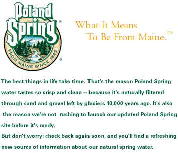
There was absolutely no text. It was done entirely with a graphic and a background (tiled graphic). The main graphic included substantial writing and yet it did not even have an "ALT" tag repeating what was written. These graphics on either side of this text represent the entire visible web page of the Poland Spring site. Those trees were actually a background (they had a lot of white space on top so that they only tiled across the bottom of the page). The logo and text graphic to the right was center-top on the page. It didn't look exactly like this: I rearranged it in Photoshop to make it more vertical. Again, these graphics that you see here, however they were arranged, were the entire content of the Poland Spring site. Most important, that means not a letter of text. The page, then, is at best an annoyance to someone with their images turned off and for someone with a text-only browser such as Lynx it can have no meaning, ever. Nor can it work for the visually impaired; that is, the text cannot be made larger nor can a computer read it out loud. It would be awkward to look at on a screen smaller than 800 by 600 (which I still consider medium) but that is not a major problem, and it will look fine on all graphical browsers. Also, all its content shows up in the first screen, which is good web design even if it is less than impressive taking the miniscule amount of content into consideration.
Despite the graphics, the page stayed under 30 kilobytes. It weighed in at only 21K. Still, that is much larger than it needed to be. And it will lead to a long wait for modem users just to be told "The best things in life take time."
And of course, being a one page site, it had no hyperlinks. Sort of defeats the purpose of a web page.
At least it had no ads.
It says to "check back soon" and gives no recommended date. Perhaps less obvious but more important, the site does not give the date that it was created or modified. Only the brave, the stupid, and those who desperately want Poland Spring bottled water will actually "check back soon" again and again and again.
SEMI-INTERMISSION |
||

|
Keep looking at the lion. He grows on you. Isn't he cute? And now back to the content: With luck, this will be the last evaluation to be bigger than that which it evaluated. That was just a warmup. In the next edition, a proper evaluation, I will look at another bottled water company— one with a real web site. |
|
|
| ||
E-mail: melancon@student.umass.edu
Experimental design. By beMWeb.

